") Don't have an account yet?
Don't have an account yet? 
Forum Thread
Riako's June of Pixelart
Forum-Index → Fanmades → Spriting → Riako's June of Pixelart
Posted: Fri, 13/06/2025 13:42 (1 Month ago)
I’d make the legs a little taller, however. They look neat, but lack the legendary look.


Posted: Sat, 14/06/2025 14:05 (1 Month ago)
Day 14: A game map
Today I once again switched my focus and worked a bit more on my tile map (see day 8). I added a few more tiles to my tilemap, and started drawing an actual game map with it. Just to see how everything might look in the end, when assembled together.

(2x scale)
It looks.... okay for now, I guess x'D Still empty, and the main issue right now is that I don't have enough variety in tiles. So I will work on that soon.
Also, I feel that the windmills look way too small now... The road is almost as wide as a windmill is tall lol.
Posted: Sat, 14/06/2025 14:54 (1 Month ago)
I find the windmill size cute ^_^

Posted: Sat, 14/06/2025 16:58 (1 Month ago)
i agree with joyfuldoggy. a farm or farmland and some forests. big spaces in germany look like that, so you could try to find reference where you live. allerdings werden windräder nicht in der nähe von leuten gebaut, weil die zu laut sind..
Posted: Sun, 15/06/2025 19:35 (1 Month ago)
Day 15: Bigger tiles
I did notice, however, that I chose an extremely small tileset, and hence there was almost no room for details. So today I threw the old tilemap in the garbage and attemped a new one - with a higher resolution.

The trees look super awkward so far x_X


Posted: Sun, 15/06/2025 20:16 (1 Month ago)
And the paths don't look so static anymore :)
As for the trees it's a solid first attempt
Maybe the shading is a bit harsh tho? Kinda looks like they're wearing corsets, there is a waist where there shouldn't be xD
And maybe make them a bit more leavey/fluffy?
The flowers look cute! But I feel like the stem and leaves need a bis more green or a different green so they stand out more from the BG

Posted: Sun, 15/06/2025 20:23 (1 Month ago)
I thought the trees were sudowoodo with their arms up in the air XD

Posted: Sun, 15/06/2025 20:48 (1 Month ago)
Ground: view from above
Trees: view from the front
I don't know how this is handled in pixel art - maybe someone more experienced could comment on this. My guess would be to either shade the ground in a way that it looks more 3D or maybe make the viewer look at the trees from a "bird's eye view" like it is in pokemon (note that this map in general looks more 3D):

On another note:
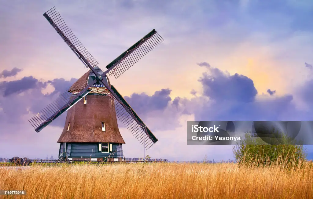
Instead of the windmills you tried earlier, why not try one like this?
Posted: Sun, 15/06/2025 21:01 (1 Month ago)
plus you forgot to add shadows below the objects. the grass underneath the tree (and a bit at the left) needs an indicator of shadows or the fact the trees are on it. technically the flowers too, but a tree is much thicker and heavier compared to a flower, so ground shadows with the flower isn't as much needed as with the trees.
green grass shading is is the next step about coloring the artwork too. cold colors like blue are used to significate lack of light source (often the sun), while warm colors like yellow (blue and yellow are directly tight to grass and other green plants) show where the sun shines.
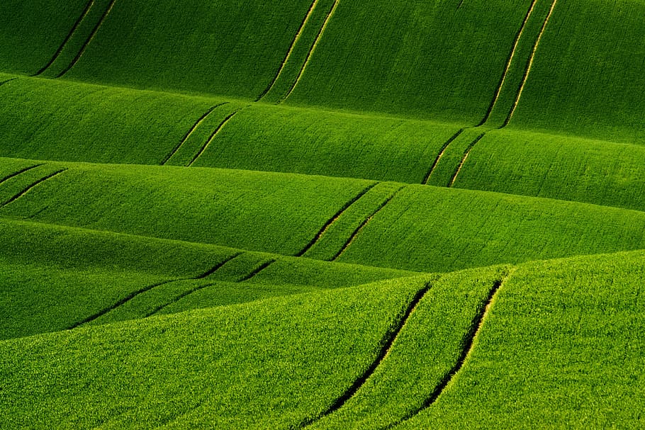
(https://www.wallpaperflare.com/green-grass-field-moravia-south-moravia-waves-shading-landscape-wallpaper-zbafb)
Posted: Mon, 16/06/2025 18:17 (1 Month ago)
Day 16: Tiles, tiles, tiles

(3x scale)
... I also added a "pig" lol. And some rocks.
Definitely an improvement, imo. But man, pixelart is hard lol!
I think one issue I have is the choice of colours? I feel like the objects tend to blend in a bit too strongly with the background. Should I typically use lighter, less saturated colours for the background (the grass and path), and darker and more saturated colours for the objects? Any tips?
Posted: Mon, 16/06/2025 19:10 (1 Month ago)
i myself have issues with colors and shading so i can't give you a tip for that. sorry. it's only a practice problem for me, tho. ^-^;
Posted: Tue, 17/06/2025 14:02 (1 Month ago)
Today I started fixing the grass in the foreground!
I think it looks better already.
The grass on the right side doesn't have shading yet. And grass in the middle is still missing.

(2x scale, previous version)

(2x scale, new version)
In my first iteration, I drew the grass rather quickly, almost in an expressionistic way.
In my second, newest iteration, I drew it very slowly, almost pixel-by-pixel. I guess the main lesson I am learning is: Pixelart is all about the detail, and especially about patience.
Posted: Wed, 18/06/2025 17:32 (29 Days ago)
I present to you, my final draft of the Caterpie drawing:
(2x scale, previous version)

(2x scale, new version)
I added shading to the background trres, added more grass and proper shading, and I added an 33% transparent orange overlay on top of everything but the grass (as suggested by fuzzywyrm)
What do yoou think? :)
Posted: Wed, 18/06/2025 17:36 (29 Days ago)
Posted: Wed, 18/06/2025 19:46 (29 Days ago)
What are you going to do next? ^_^
Posted: Thu, 19/06/2025 19:44 (28 Days ago)
Day 19: A Farmer
Today I wanted to draw a pixelart character, which I could eventually add to my tilemap (see day 16). I wanted the style to be rather similar to the Gen IV Pokemon Overworld trainers. And I wanted the character to look like a farmer:
(Original)
(4x scale)
What do you think?
In the next step, I want to draw him face north, east and west, so I could technically make it look like he walks across the map. Perhaps with an actual walking animation.
Please critique and help me improve :)
Posted: Thu, 19/06/2025 19:58 (28 Days ago)

Posted: Thu, 19/06/2025 20:14 (28 Days ago)
The face is a little too round. If you look at the HG/SS map sprites, all of the faces are mostly round, as a base, but they are distorted somewhat (height of head, angularness of the chin, flatness of the top) to give every sprite a little bit of character, from the elite four down to the random biker npc you see like once.
If you want it to more resemble Pokemon sprites (this is just a style thing, so you may or may not want to follow this advice):
-The only NPC's with beady eyes are the children. Other NPCs (with the exception of some like the old man, who have flat eyes instead) have white lines on the left for the left eye and the right for the right eye.
-Caps/hats on Pokemon map sprites are drawn somewhat cartoonishly- for instance, the youngsters hat (1st row, 3rd-to-last column) is far too large, and the captains hat (2nd-to-last row, 3rd column) looks almost as if it were edited onto him from the front view, and practically morphs as he turns around. Again, this adds alot of character to the sprites, but it is a style thing, so you may or may not want to do this on your own sprites.
-Pokemon sprites avoid any hard lines except at the edges of the sprites. Most people consider sprites to look much better if this is done properly. (The only hard line in your sprite that really sticks out is the edge of the hair)
The shading and the body of your sprite does look just like the Pokemon map sprites!
PalPad is fine too
Posted: Fri, 20/06/2025 13:47 (27 Days ago)
I have also one my first attempt at making the character face east.
Day 20: Facing east
(Original)
(4x scale)
I feel like they don't fully look like they're the exact same person - but I don't know why?
To me, the second one looks a bit like someone who works at a grocery store. And the firsst one looks more like a farmer... Perhaps the hair is a bit longer on the second one? And something feels different about the hat.

Posted: Fri, 20/06/2025 14:16 (27 Days ago)
