") Don't have an account yet?
Don't have an account yet? 
Forum Thread
Riako's June of Pixelart
Forum-Index → Fanmades → Spriting → Riako's June of Pixelart

Posted: Sat, 21/06/2025 19:01 (27 Days ago)
Day 21: They see me rotatin', they hatin'
(Original)
(4x scale)
I think it looks much better yet. I am especially happy with the northwards facing pose. I think that's almost perfect.
But the south and east still look... a bit different than the original pose.
I feel like the original pose looks slightly more chubby? But as soon as I add another pixel to its belly, he looks too big compared to the OG.
Thoughts?
Posted: Sat, 21/06/2025 20:02 (27 Days ago)
(I'm not sure if that's what you did, so feel free to disregard if you already have.)
Perhaps create a couple blank blobs as a base for the sprite - one for east/west, and one for north/south. Then just color it in as desired.
Posted: Sun, 22/06/2025 19:17 (26 Days ago)
Today I wondered: Would my characters perhaps look better with more detail? So I tried a 32 x 64 canvas (instead of 16 x 32 as I've done previously)
(4x scale)
... And the answer is: No lol. No they don't look better x'D I think he looks super weird now, and it is even more complicated to make the character look good.
PenScales: Don't worry, I did just flip the image to get the west facing character, based on the east version! :)
By blob, you mean something like this?:
(Not my own creation; got it from google!)
But perhaps already with basic shading? ... It sounds really intriguing, but also super challenging to set up. I am unsure how to do that (except for trial and error). Does anyone have a good tutorial source for this?
Posted: Sun, 22/06/2025 19:22 (26 Days ago)
I find the character okay as is. (The smaller version)

Posted: Sun, 22/06/2025 19:27 (26 Days ago)
Posted: Sun, 22/06/2025 21:10 (26 Days ago)
The main benefit of this is keeping things symmetrical. It also helps to keep track of the pixels; if one side has four red pixels for, say, a sleeve, give the opposite side four red pixels as well.
(This doesn't apply if you want to make things unique, like one side of the head having longer hair than the other, etc.)
Posted: Mon, 23/06/2025 19:52 (25 Days ago)
PenScales: Yes, that makes sense :) I think I might do that tomorrow!
Day 23: He walks
(4x scale)
I think it looks rather good!
I find the sideways walking most difficult. It's so awkward to draw bending legs when I only have three pixel long legs? (2 pixels, if we exclude the bottom outline)
Posted: Mon, 23/06/2025 19:59 (25 Days ago)
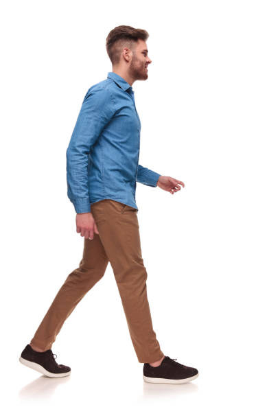
[https://www.istockphoto.com/de/fotos/man-walking-sideways]
Posted: Tue, 24/06/2025 03:31 (25 Days ago)
Posted: Tue, 24/06/2025 05:12 (25 Days ago)
I still don't know a better word. >x<
Posted: Tue, 24/06/2025 10:08 (25 Days ago)

Posted: Tue, 24/06/2025 11:00 (24 Days ago)


Posted: Tue, 24/06/2025 11:01 (24 Days ago)

Maybe try bringing the right leg back cause it's only moving forward then back to the side.
Posted: Tue, 24/06/2025 18:12 (24 Days ago)
Day 24: He sits (and walks properly now)
(4x scale)
I fixed the walking sideward animation by exaggerating the movement. I think it looks so much better now!
What I've really learnt so far is that pixelart is often not about accurate details that you depict, but more about depicting an idea/a concept, which the human eye then interprets in more detail. It's quite fascinating!
And, as a bonus: I also made my little guy sit down and fall asleep :)
(The final sitting down animation looks much better when slowed down by 50%, and by having the last two frames then repeat a couple of times. But that's not possible when I have it on the same canvas as the 4-frame walking animation. That's okay.)
Posted: Tue, 24/06/2025 19:42 (24 Days ago)
Posted: Wed, 25/06/2025 19:15 (23 Days ago)
Day 25: Farming

The end result looks quite simple, but it was actually quite some work. The corners and edges around the crop fields needed to be made for every single edge case (pun intended):

Every possible combination of edges and corners had to be considered. Corners top left, top right, bottom left, bottom right, top left + top right, top left + bottom left, top right + bottom right, ..., ...
There were 16 different variations, as you can see in the tileset I've created.
Posted: Thu, 26/06/2025 18:59 (22 Days ago)

Posted: Thu, 26/06/2025 19:11 (22 Days ago)
Maybe you could add some cows eating the grass on the bottom right corner.
Posted: Fri, 27/06/2025 19:06 (21 Days ago)
Today I went back to character design and started working on a blob, as suggested by PenScales.
On the left is my last character design for reference. On the right, I started created a "prototype" base which I could later use for new designs. Just to get the proportions and shading right.
Any tips? Does it even make sense to add shading to it, or will it entirely depend on the character's hair and clothes?
Posted: Sat, 28/06/2025 03:50 (21 Days ago)
Think of like the basic Pokéball being the base one on which all the others are made. Same concept.