") Don't have an account yet?
Don't have an account yet? 
Forum Thread
Rate the Signature above you
Forum-Index → Forum Games → Rate the Signature above you

Posted: Fri, 14/10/2016 23:53 (8 Years ago)
it´s not that the image is too big or what - but it´s way too blurry in my eyes. Could have been centered with a bit of text too.:Y

Posted: Sat, 15/10/2016 00:52 (8 Years ago)
The panda's adorable. ♡


Posted: Sun, 16/10/2016 04:04 (8 Years ago)
I love the picture, but it lacks some essence. But, that's just my personal preference.

Posted: Sun, 16/10/2016 04:29 (8 Years ago)
I love the stamps, I love Undertale! c: But for some reason the sig as a whole doesn't appeal to me. ; v;

i only think i'm cool but i'm not

Posted: Sun, 16/10/2016 07:14 (8 Years ago)
It looks nice, but I feel like it'd be better if the text was on the left of the image.

Posted: Mon, 17/10/2016 16:20 (8 Years ago)
It's simple and neat, the little stars are cute. The pigeon is adorable and I really like the art style. I'm just not a fan of links in big font. xP
Posted: Mon, 17/10/2016 17:22 (8 Years ago)

Posted: Wed, 19/10/2016 01:23 (8 Years ago)
Looks nice! ;)

Posted: Fri, 21/10/2016 01:12 (8 Years ago)
•°. * уσυ ¢αи'т נυѕт ℓєανє α gυу ωнσ'ѕ тяуιиg нιѕ вєѕт ∂єѕριтє єνєяутнιиg αℓσиє, у'киσω? * .°•

Posted: Sat, 22/10/2016 21:41 (8 Years ago)
Eh, I'm not the biggest fan, but I can understand why you chose to set your about me that way!

Posted: Sat, 22/10/2016 21:57 (8 Years ago)
-2 for gif; though the aesthetic merits some points, the way it's GIF'ed really hurts the eyes; it would look much better if it were a still image.
-1 because scrollbar.
i only think i'm cool but i'm not
Posted: Sat, 22/10/2016 22:09 (8 Years ago)
-1 for space usage. The blank space on the left just kinda looks weird.....
-1 for buttons. the buttons are kinda small, and it's hard for me to accurately click them
•°. * уσυ ¢αи'т נυѕт ℓєανє α gυу ωнσ'ѕ тяуιиg нιѕ вєѕт ∂єѕριтє єνєяутнιиg αℓσиє, у'киσω? * .°•
Posted: Sun, 23/10/2016 02:39 (8 Years ago)
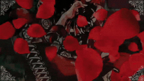
-2 for large gif; I just don't prefer humongous pictures in sigs... ; v;
-1 for green colored text; doesn't match well with the gif. Also, it's too close to the gif. o:
i only think i'm cool but i'm not


Posted: Mon, 24/10/2016 17:38 (8 Years ago)

Posted: Fri, 28/10/2016 20:49 (8 Years ago)
I think it cool,!
”Hello There! I am Alter Ego, your technological guide!"
Posted: Fri, 28/10/2016 20:51 (8 Years ago)
No signature, so I can't rate it.
(owo)


Posted: Sat, 29/10/2016 17:33 (8 Years ago)
It's nice<33
”Hello There! I am Alter Ego, your technological guide!"

Posted: Sat, 29/10/2016 20:21 (8 Years ago)
It would be nice if there was some more content in it. Plus I'm just really not into that kinda stuff.
4. It matters not how strait the gate,
How charged with punishments the scroll,
I am the master of my fate,
I am the captain of my soul.
-Extract from Invictus, William Ernest Henley