Forum Thread
DeviantArt's club
Forum-Index → Fan Clubs → Inactive Clubs → DeviantArt's club Show
hidden content
Soo.. here I go. First, off I haven't
watched Magi yet (don't hit me please) so I have no idea if this
pose or if the character is accurate/fitting. But I think it comes
pretty close to the original concept idea.
The thing I like the most about this drawing is that you have a really good sense of lighting and shadows //jelly//. You can clearly tell where the light is coming from which is really great! The cloth is also shaded really nicely it looks really smooth and nice ;w;. The pose is also dynamic and interesting ^^.
As for improvements I would say anatomy and some other things I can't really sum up in a single word x3. The anatomy looks a bit funny to me (left leg in particular) but it's accurate enough that it isn't really noticeable. But anatomy is a big issue for all artists who draw haha so don't worry about it and just keep practicing ! Other than that I feel like some angles look a bit awkward? I feel like the bandages and some of the hair could be more "flowy" idk how to put it. But the curves look a bit unnatural at some places.
Shading is also nice (especially for the cape? (clothes), idk why I really like the cape though aha). It's kinda hard to say anything about it since the image is pretty small =w=.
Overall, I think it's a nice piece! I love the effects too, the blood looks really realistic and I like how the knife shines. You could try adding background next time (though from your feed I heard you dislike them xD) and play around with colours more. Just experiment with your pieces ;w; You've shown a lot of improvement in the short time I've known you!
I hope you found my critic?/comment helpful! C:
Haha, probably just my style xD But thank you!
@Yuucchii
Oh my ♥ Such a wonderful critic! Haha yeah, now that I do look at it, the legs look a little funny xD Anatomy isn't easy, especially for this pose I was drawing. The sketching took me 4-5 hours, and it was just me trying to make the anatomy look right :b But I'm glad it isn't too noticeable. And I'm so glad you like the shading! :'D I tried a completely new style/new brushes, and I also love how the shading came out x3
I can tell you that I did draw a background for it xD Took me 2 days, but I didn't like it as much, and thought that the drawing would look better with a background. This is the background which I was originally going to use. I'm not the best with backgrounds, so I just decided to leave it to the side.
Overall, thank you so much for your kind words and improvement tips! x3 I'll definitely keep them in mind the next time I draw a person haha. This has been very helpful for me :'D
[i]"Shinah. It means
Haha glad you liked it, I didn't really what to say XD. Yeah anatomy is really hard for me too, the pose is great but I can only imagine how difficult it would be draw,., blergh. Yeah this style is really quite different from your usually cell shading style technique haha glad you tried out different things! C:
Haha that background looks pretty nice actually! I don't really make backgrounds either but sometimes I'll use pre-made seamless BGs on my art. If I do choose to make a background I usually just messily paint it on, on one layer lol (too lazy to line it too)
Glad you found the critic insightful!
Yuucchii pretty much said everything. :'D
But if you wanna take it even one step further i can try and kinda teach you a little bit of color theory and warm/cool shading.
btw the top part really bothers me cause it feels like his back is on the front and vice versa ;-;
like
WHY
IT'S NOT EVEN THAT GOOD
IT'S JUST A
DERPY DRAGON

incredibly sh*tty but whatever....
also, can you guys help me in a voting contest?
it's on a poll and i'd greatl appreciated all of the support i can get
the poll
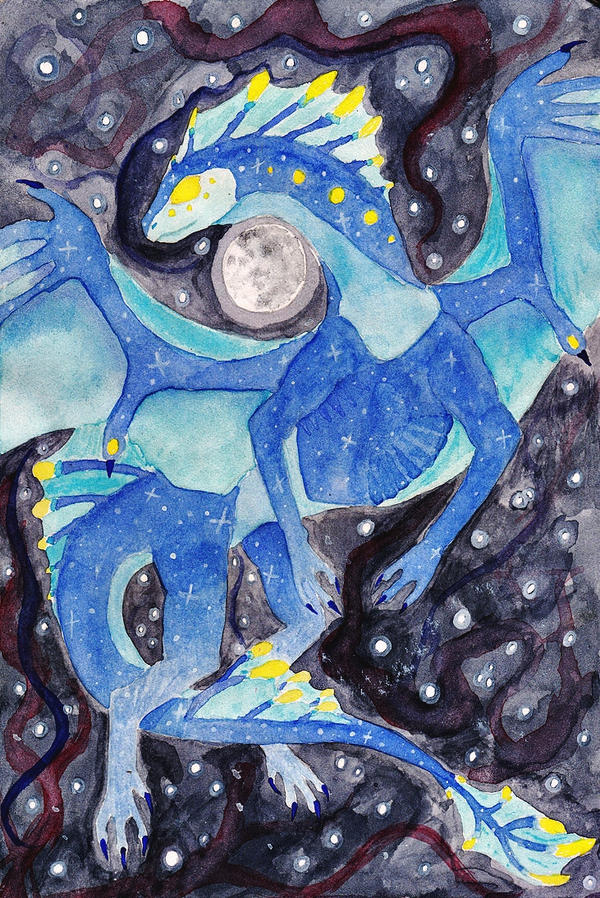
my pic is the dragon one
I love this drawing!
Also...
What do you think about them ?

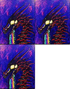
here's.....erhm....''smaug''
though it looks more like smaug's brother XD


This is awesome, I love the colors!
I like the robot effect you used, and the eyes are nice, great work, good job !
it's axolotls in english XD
the mexican watermonsters ^^
i tried to learn my friend draw, step by step, yesterday
it was a lot of fun XD


 Don't have an account yet?
