") Don't have an account yet?
Don't have an account yet? 
Forum Thread
Rate the Signature above you
Forum-Index → Forum Games → Rate the Signature above you
Posted: Thu, 08/12/2016 03:27 (8 Years ago)
-1 it seems fairly empty [i.e. just an image]
-1 I don't really understand the photo?? and it seems just kinda generic [if that makes any sense]
-0.5 the image is a bit too big imo and could use rounded corners / some transparency / something to make it more than just some rectangular image

[FlightRising] ☆ [Adopts] ☆ [Doodles] ☆ [Characters]
Posted: Thu, 08/12/2016 08:25 (8 Years ago)
Cute plushies!
But a bit too empty
**sigs a wip,,

Posted: Thu, 08/12/2016 08:45 (8 Years ago)
cute but not organized at all

Posted: Thu, 08/12/2016 11:36 (8 Years ago)

Posted: Thu, 08/12/2016 15:12 (8 Years ago)
No signature.


Posted: Thu, 08/12/2016 15:25 (8 Years ago)
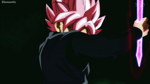
-1 bc of the scroll


Posted: Thu, 08/12/2016 19:22 (8 Years ago)


~Eat the Rude

Posted: Sun, 11/12/2016 01:16 (8 Years ago)

Posted: Sun, 11/12/2016 08:45 (8 Years ago)
It's fine.
4. It matters not how strait the gate,
How charged with punishments the scroll,
I am the master of my fate,
I am the captain of my soul.
-Extract from Invictus, William Ernest Henley

Posted: Sun, 11/12/2016 13:25 (8 Years ago)
-2 sig very big
-1 font isn't just my taste o:

i only think i'm cool but i'm not


Posted: Sun, 11/12/2016 13:27 (8 Years ago)
How to make a perfect signature
Posted: Sun, 11/12/2016 14:22 (8 Years ago)
”Mysterious… surprising… and law-defying… Isn’t that right?”

Posted: Sun, 11/12/2016 14:30 (8 Years ago)
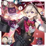
imo there isn't really a specific look to it, just random pictures and text.

Posted: Sun, 11/12/2016 15:01 (8 Years ago)
It's just an image, and the words are honestly difficult to read. It's just kinda ;v;

Posted: Sun, 11/12/2016 15:03 (8 Years ago)
Eddie m'boi u need something else there
[FlightRising] ☆ [Adopts] ☆ [Doodles] ☆ [Characters]
Posted: Sun, 11/12/2016 15:17 (8 Years ago)
i only think i'm cool but i'm not
Posted: Sun, 11/12/2016 16:22 (8 Years ago)
Perfection ♡
Posted: Sun, 11/12/2016 19:46 (8 Years ago)
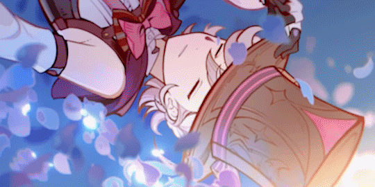
It's simple and organized, yet the links are a bit small? ;0; plus the gif would look better with rounded corners imo
Posted: Sun, 11/12/2016 19:48 (8 Years ago)
Like with the other rate, nothing I'd change.