Forum Thread
Tracing / Pixel Art Guide
Forum-Index → Fanmades → Spriting → Tracing / Pixel Art GuideWhat's Tracing ?
Tracing is when you pixel/draw/use something someone else did first to create your own art.
Tracing is cheating only when it’s used to pass off someone else’s art as your own, but it’s never dishonest simply to use what others have learned to improve your skills.
Tracing is an excellent way to teach yourself how to accurately pixel/draw something, I used the pokemon sprites very often to learn how they're made and how to meet the style.
Example of tracing here on PH:

As you can see, the original icon was taken and changed to the event icon.
Please do not say something like "done by me", it's "edited by me" in this case and that makes the difference, respect the work the artist has done before you took/edited it !

Even if more than half of the sprite was done by you, it's still tracing, the base sprite gave you the shape for your work.
PH has a lot of event sprites using older and the newest pokemon sprites as bases and that's fine as long as you don't claim it completely as your own work.

But there are also sprites whose bases were done by other artists and I really don't know if PH has all permissions for those traced sprites. As long as they stay like this, it's stolen art.
Example: Skiddo from here was used to create Skugar ➜
Making a sprite out of another artist's design or using poses for your own art is also tracing !
Look at other artist's sprites first and figure out a good way to not trace too much, it's YOUR work the users want to see, no copied stuff.
I hope you now know what tracing is about, it's the base of trust artists give to each other and if you steal art, you're not worth being honored for "your" work.
Programs & Tools
You can use every program that allows you to set a 1 px pen without anti-aliasing, so it won't blur single pixels and lines !
Examples of programs you may use:
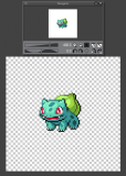
MS PAINT
+ free / on every windows computer
+ runs on every pc, fast and easy to use
- only 1 layer
- no transparent background
I once started pixel art with MS Paint, it doesn't make much difference to other programs pixelwise, you just need to have another program to make the white background transparent afterwards.
GIMP
+ free
+ multiple layers
+ transparent background
+ easy color adjustment / color wheel
Photoshop / Clip Studio Paint
+ multiple layers
+ transparent background
+ easy color adjustment / color wheel
- expensive (if you use it for pixel art only)
It's always nice to have multiple layers to put every part of a design on a different layer and adjust it without damaging the base design. Every pixel art needs a transparent background, so you'll need a program that's able to save like that.
It doesn't matter if you use a mouse or a tablet pen, use the one you like more.
How to start ?
Before you start your actual pixel art, think of a design. The design shouldn't have too many details, because you want to show a few details others may recognize and notice cleary.
A Pokémon sprite is always 96x96 px big, front and back sprite, set your canvas at this size (or wider if you put reference/s on it).
It's important to check out what body size to use for what kind of Pokémon, it depends on how detailed, shaped and big it is. To keep the right size, put a fitting original Pokemon sprite on your canvas, so you have a reference.
All Pokémon usually look to the left (front), so they look at the opponent in battles.
1. Baby Pokemon are the smallest sprites, a few pixels smaller than the small Pokemon.
On the 96x96 px canvas they may look a bit lost, because there's much empty space.
2. A lot of base Pokemon are small sized, they don't need an impressive presentation, more cute.
3. Mid size sprites often have more impressive poses, the size gives enough space for emotions in the face and details. Perfect size for many evolutions or cool Pokemon without evolution.
4. Big size sprites don't touch the border of the 96x96 px big canvas unless they have too many details (like Reshiram here).
Try to set the focus on the main stuff, it's impossible to display all details at once.


All sprites are always set in the middle of the canvas, try to keep that in mind when placing and saving it. You should check if the original sprite is on the same place as the one you made to prevent weird looking boxes like this ➜
Alolan Diglett isn't at the same height and looks off, it's fast to change, so no big deal.
When you chose your sprite design and a fitting size, start to skribble with the 1 px pen.
This topic is really hard to explain, because pixel lines seem so small and not important enough..
Wrong ! They are really important and the only way to give your pixel art smoothness where it's needed.
It's difficult to pixel perfect lines immediately, they need time to adjust. Look at the preview everytime you think a part looks fine. If you don't have a program with a preview, prepare to zoom in and out a lot of times, you'll get used to it even though it's annoying.
The preview has to be the original size, not blurred or somewhat zoomed in.
Pokemon sprites are always done with dark grey to black lines (depends on generation, I use black ones) and edited when the shape and colors are nearly finished, that's the easiest way.
Let your lines look soft, the right smoothness is the key to professional pixel art.
Spiky stuff shouldn't look too spiky. Do not let 2 lines end in parallel lines, that's the most frequent mistake.
Ninetales mane and tails are a nice reference for edgy stuff.
Keep your lines simple, especially when it comes to details. The more lines you add the more messy it may look. Instead of pixelling too many lines, use colors to let details show their potential.
* click on the picture to see all
details
To highlight the best parts of the sprite, you need to pick the right colors.
Do not simply pick the colors from the 3D models or sugimori artworks, they're too greyish and the sprite will look monotonous in the end !
There are 2 ways to pick the right colors for your sprite:
1. Pick the color from the artwork/3D model and try to change the color in the color wheel to make it look more colorful and fresh. (Not that easy, sometimes you still need to pick a new color, I recommend 2.)
2. Look at the artwork and open up already existing nice looking sprites to pick colors that could fit, change them a bit and you're done.
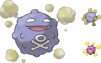
Here's a sample of how different colors can be:
Artwork and 3D model really lack when it comes to saturation. The colors really differ on sprites and they need those differences, without them they'd have nearly 0 contrast and the details couldn't be seen without zooming in.
But we want to have something small where everything that matters can be seen at first sight !
Color picking is one of the most important but also difficult skills to do art fast and beautiful, just don't give up, try out whatever you think looks nice.
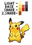
There are 3 kinds of colors: base, shade and light color
Most pokemon sprites only have 1 shade and light color per base color, but there are exceptions that need a 2nd shade color. The 2nd shade color should only be picked when there's a special/dark area you really need to draw attention to.
Try not to shade too much, most of your pixel art needs its base color to look clean.
Just pick colors when they're needed, not every area needs all kinds of colors.
Most out- and inlines are black/grey and have 1 to 2 light colors per base color. The outline light color should be a bit darker than the main shade color. You may use a brighter inline color for details.
The sun always shines from the upper left side of the canvas, so where the sprite is touched by the sun the lines and some color areas should be the brightest.
Only use white as light color for very bright base colors (yellow, bright blue/green/grey, etc) !
Details within the sprite, like the mouth, eyes and stuff on the body should have more colored lines unless they're in the shadows.
When you shade and light the right areas, you'll see that things look round, more detailed and your pixel art comes to life.
If you're unsure, look at some existing sprites and try to learn from them. If you think it looks smooth enough, don't push yourself too much and edit every little pixel that could be lighted/darkened, it's not necessary.
Just have fun letting your idea become a design !
* click on the picture to see all
details
If you have a sprite that's old or doesn't seem to fit in the 5th gen style, it's not that difficult to edit it. Mostly the sprites are too big/small, have too many different color shadings and seem to look a bit blurred.

We'll look at the old Tom Nook Bidoof here, that's too big, has blurred teeth and too many colors:
First adjust the colors and add a reference of Tom Nook, whose design should be recognizable and the original Bidoof sprite to compare size and details. Nothing has to be perfect at this point.

As you may see, the colors are cleaner now and you're able to see the main details on the sprite that should be highlighted in the end, like the apron and face. You'll also notice that the tail isn't colored right here, the dark area is missing.
Try to adjust everything piece by piece, start with the part you can imagine best.

(I started with the apron and leg, then worked my way up.)
Look at the preview (or zoom out) everytime you think a part looks fine now. If you think it's okay for now, go on, you can come back later to that part and adjust it.
In the end adjust colors and line colors that you think don't fit yet and you're done.


Glowing and other effects are no pixel art and shouldn't be used on Pokémon sprites in any way, it looks messy and amateurish, please don't even think of it.
Same goes for resized pictures, also resized pixel art isn't pixel art anymore if it's blurred!
If there's anything missing or seems wrong, please let me know !
You can comment/palpad me for more information, questions, critique or if you need help, just stay friendly.
You can see the full staff list here c;
Edit: I just did the tutorial pixel changes and the Tom Nook rework sprite.
I was informed by a staff member that some sprites are outdated and the creators left/are unknown, so I took one of the very old ones that just doesn't fit the gen5 style and reworked it to show how it should look like in that style.
The whole thread is meant neutral, so I hope you can take it like this now.
i have to agree with shinypooch.
i'll be sounding as civil as possible, so sorry if in any case you misunderstand my own tone.
'a' staff member. did EVERY staff member agree to this, yes? from what i know you aren't a part of the staff nor artists, i would expect something like this from them?
i wonder which staff asked and why they asked YOU about a rework/tutorial, not one of the artists?? that's part of THEIR job and no offense but it makes me feel like the artists here may or may not be underrated!
i'm going to be blunt; this seems selfish, as if you were portraying yourself that you are better than anyone else.
your pixels are great! your art is nice! you might've wanted to help people yes, but you should have thought about it twice, including your tone in this.
I am a person who can live with critics very well if this critics come from persons i work for ... And critics wich come from our team. But puplic critics in this way i dont need to accept and they dont afect me ..
So .. this guide is helpful and well made for private artists and spriters but only without this examples, sprites made by me or other spriters from here, so please change this examples to selfmade ones. If you want use sprites made by others for examples on a puplic feed it would maby be better to ask before ... me you have not asked ^^
This is the only thing i write to this topic :B
I never thought about Torcharch's leaf, because i liked the whole poké as it exists... And also with the other fakemon sprites... If the spriter thinks it's perfect, and Riako tells the same, then we must accept the way they exist, not to blame them...
Okay, i'm always telling my opinion when a new event comes here, but i'm just telling it's a crap or it is amazing, not because the way it's drawn, but because of my feelings for the poké have been made :)
If you can do it better, tell Riako to make you the one-and-only spriter here, and then you can make pokéheroes better :)
(Sorry if you don't like it, but this is my personal opinion, and since this is an free site, everybody can tell his/her opinion :) )
I have 0 experience with spriting and I would also like to see suggestions on what programs to use and whatsoever. Or if it's easier to do pixel art with a tablet or with a mouse^^
Not everyone can make flawless sprites but there's always room for improvement.
I mean, the sprites for Mega Gyarados and Lopunny got a new version so why not accept some criticism for other sprites as well?~
Banner drawn by Hime-Nyan~
but yet you pretty much used sprites from this website that other people had made for redoing when i'm certain they haven't given permission, and even if they ARE unknown, that's even more of a reason to not use them for something like this. correct me if i'm wrong but if someone just took something you made, redid it without your perms you'd be pretty mad/upset as well?
Also the official copyright says that everyone is allowed to use public stuff for educational and scientific purposes.
If you're not okay with your sprites being public or criticized in any way you shouldn't be a staff member of a public game.
As I mentioned above, I couldn't get a list of sprite creators from staff members, because they simply didn't have one. All sprites used are not to blame/offend anyone, I didn't know who made what sprite, just took the ones that would fit in the tutorial to show the difference between own and gen5 style.
All artists have the same right to post tutorials and their art.
Sentences like "this guide is helpful and well made for private artists" and "I am a person who can live with critics very well if this critics come from persons i work for ... And critics wich come from our team" shows that YOU think the staff is worth more than every other artist. That's sad to hear..
I won't hide just because there is a staff on this site (like on every other too), I waited for a tutorial 3 years now and no staff member wanted to do one, the existing one is outdated and the links are dead, so why shouldn't I do one ? It's my own decision and I liked to do it.
It would be nice if you still read the whole tutorial and not just look at the pictures, so you may imagine why they're needed to show differences (like in every tutorial).
I started with pixel art in 2007 and don't need to be in the PH staff to be a good pixel artist, because it's fun for me and I love to pixel every week. I decided to share my knowledge and made it as simple as I can.
Everyone starts with trashy art and then improves, some faster, some slower, but it's the fun and will to improve that makes pixel art so nice, I hope a few users will like to try things out and maybe show me !
I'll add pros and contras of programs and what you may use to do pixel art within the next days.
Thanks for the suggestion c;
Edit: If someone citicizes my art, I think of it and am happy about someone looking at my art more precise. I mean, it's their time spent on writing a comment that could help be improve faster. Why taking it so negative ?
"they are needed to show differences"
yes... if... permission by the original artists were given! i don't care if this website is public, these were STILL made by people who put effort and love into their work.
doesn't matter if they're a staff. they. are. also. ARTISTS!
as an artist if i were to see my work used like this by some rando, yeah, i'd be pretty upset. i'm gonna sound rude but do you think your work is perfect enough NOT to be used instead of other's art? as an artist by -heart-, this just feels wrong but you do you.
also maybe ask people instead of waiting.
I understand that every artist on this site does their best, and over the past 6 years I could see how much the art on this site improved. Just try to be open for critisism, and take it as an opportunity to improve.
I myself am thankful that she took the time to make this tutorial for public use, because it motivated me to actually try it myself.
So now...can we just move on from this?
But i need to be honest here, because when you are a artist and publish your art somewhere then you need to expect some kind of critique. That's just fact. If you can't handle critique, then you shouldn't post your work anywhere, because that's going to happen sooner or later to anyone. (And yes, i know there is a difference between 'hating on someones art' and 'making critique on someones art'.)
And i can't see anything bad here, to be honest.
As a digital artist myself i would've been glad someone would take their actual time to show me what i did wrong or what i could improve, because yes, that's exactly what i want.
That discussion aside, to me, the guide would also be helpful (but that's just my opinion, i think for people that already started with pixeling i will be helpful for sure~) when i would know how to start as a beginner. What program i could use, how i should start at all, what "Beginner Mistakes" are, if multiple layers being used as well and so on. (Yes, i'm a noob in this, but pixeling sounds fun and i would love to try it out when i would actually know where to start, lol) I think that could be something nice as well.
And now, as Nino said, please let's just move on. Everyone is allowed to make guides here.
With someone that's been doing pixel art since 2007, has lots of experience and is professional with her work, I would definitely vouch for Cony, and say that you should be taking notes from her if you want to improve and learn a thing or two. I'm very thankful and nothing far from grateful that Cony is showing here this tutorial for the community and is willing to help people out, even though there's a lot she personally doesn't support and advocate for here on site.
Despite how it looks, spriting is not easy...
This being said I won't take any side in the argument above but I will dearly enjoy the useful tips.

Not to mention a staff member, an actual spriter on the site, commented and said they didn't like your use of examples.
Literally more content of this tutorial was calling out the creators and editing /critiquing pokehero than actually being helpful
It's not that easy to take criticism without taking it personal, it may hurt people also if it's not intended.
We're all human and most of the interested users are artists, so we should learn and work together.
The topics for beginners "Progams & Tools" and "How to begin ?" were updated.
If something is still missing or you want to know more about, just message me or comment.
 Don't have an account yet?
