") Don't have an account yet?
Don't have an account yet? 
Forum Thread
The Everything Arts Club (Accepting!)
Forum-Index → Fan Clubs → Inactive Clubs → The Everything Arts Club (Accepting!)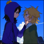
Posted: Thu, 06/04/2017 18:58 (8 Years ago)

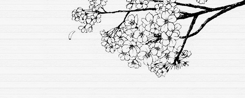
idk I like watercolors
I did this in less than 10 min as a doodle and I kinda like it ?

Posted: Thu, 06/04/2017 19:04 (8 Years ago)


Posted: Thu, 06/04/2017 19:07 (8 Years ago)
Posted: Thu, 06/04/2017 19:10 (8 Years ago)
T
E
A
C
H
U
S
@all
Fursona's first art,, made when i was liek, 9
warining!: eye bleeding colors


Posted: Fri, 07/04/2017 01:19 (8 Years ago)

a thing??

Posted: Fri, 07/04/2017 01:32 (8 Years ago)

wip
I don't know where I'm going w/ the background, it's a huge wip still.
@-Hoot-
I have no words.
@Crystal
wow, old fursona time? I got an old fursona too. she's old.
but seriously, it does hurt my eyes, definitely agree.
@Aki
you must teach us-
I enjoy how the colors go well together, and it's not all over the place.
@Foxly
I did a lot of zooming in on that piece, and noticed that the shoulder that is not completely seen merges with the neck, and the chest is much smaller below the collar.
click the image above to go to my toyhou.se

Posted: Fri, 07/04/2017 02:01 (8 Years ago)

|| My Toyhou.se - If you post my art to your TH page, please credit me under the name "Pearlousthetic". ||
Posted: Fri, 07/04/2017 03:32 (8 Years ago)
I will agree with the odd look of the Giratina, and I have to admit that the look of the headdress thing looks odd too...?
@Everyone
woo, working on my micropidgeon myo thing

lOOK AT ALL THOSE COLORS
huge pallete, but I like to be cautious and put a pallete w/ every color possible when I have a reference for those colors (for example, the feather colors were drawn from a reference, with every color in there so the speckle would look really nice, and the flowers, I did the same)
as said, I experimented a l o t with the speckle tool, but it looks really nice looking (I need to clean some stuff up, though)
click the image above to go to my toyhou.se
Posted: Fri, 07/04/2017 07:46 (8 Years ago)
god, i love the way everything just?? blends in??
teach us oh great one
@we are the crystal cats
first fursonas, ouch
and you're right, it does hurt to look at
@hootie and the blowfish
u w0t m8
@ham
i really like the background on the cat picture, and the only thing i don't really like is how i can't see the other eye. besides that, it looks amazing! and the micropidgeon looks gorgeous so far? i adore the way you drew the flowers and the kind of...watercolor-y look to the current progress.
@flaming pile of sin
heck that looks good :0
but the giratina's mouth-thing looks a bit awkward?? i dunno how to explain
@all
i finally got a tumblr and i made myself a mascot


now to gather art of them //wheezes
Posted: Fri, 07/04/2017 12:39 (8 Years ago)
Im not sure which one youre refering to,but if you mean the pink one,the shoulder kinda is connected to the neck,and the small fluff below isnt part of the neck

Posted: Fri, 07/04/2017 13:28 (8 Years ago)
made this for Fififoxy in my shop!!

I was wondering if I could get some critiques ;^;
Posted: Fri, 07/04/2017 13:34 (8 Years ago)
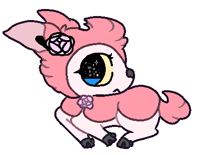
Looks like an interesting character :0
@gaysis
purrfecto
@all
Hello
I have 10 commissions
S a v e m e
Posted: Fri, 07/04/2017 14:52 (8 Years ago)
The mouth seems too close to the nose,and the end of the mouth points too high up.as for anatomy,the line makes it look like she has only 2 toes. Theres also a few parts of the lineart that needs to be "cleaned up"
Offsite comm

Posted: Fri, 07/04/2017 15:35 (8 Years ago)
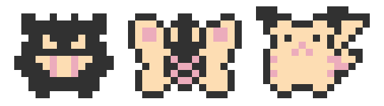
There are some really fine colours on the Pikachu lineless, although some of the edges are a bit jagged, like the tail.
@Sky
for Rep's Chu, I think that it lacks a bit of forehead, since right now the forehead looks as if it's indented into the left eye.
I also love the Litten Rowlet creature, although I believe it's left tuft is too big for it's angle.
Your orange foxlike character art is really cool, and almost a bit creepy! But I think the right arm is placed too low.
As for your green cat character, I think the left eye is a bit weird. Normally when an eye gets close to the edge of the face from the angle you're viewing it as, it tend to get more squishes vertically. But in yours, it just looks like the edge of the face cut off the rest of the eye.
@Panta
I really like it, although I think the calves are a bit weird, maybe get rid of the back bump where the joint is?
@Popplio
Nice comic! Seeing that kind of makes me want to make my own, although I haven't made any digital comics before, and I'd probably forget ;_;
also, I think it'd look more 'fitting' if for the 3rd panel you also gave the character lines.
or maybe you made it up? idk I have a bad memory and now I'm just curious :0
@Nishi
Those two characters in the scarf(I'm assuming?) is very cute! Although I think the yellow-green border is a bit-
distracting?
@Error
Nice! Although the airbrush edges are a bit uneven, not sure if intentional or not.
@-nebby-
The character(I think their name is 'grape'?) with the dark hood looks quite cool, but I think it's forehead is way too long/big.
@The-Doctor
I'm really liking those! But I think the placement of the left eye on the reddish brown creature is a bit weird, it's too high up, and the eye is maybe just a bit small.
@-Flamey-
I'm not sure if it's an intentional design or not, but in Giratina's origin form, it's mouth is hidden. While you have it's mouth above it's-
uhh--
mouth- thing
But otherwise I really like how the characters almost circle around each other, while with the background split.
I apologize for those that I didn't say anything about their art, I did look at everyone's art, and I didn't ignore a single one. Today I only replied to art that I had critiques for, because the last time I posted critiques and compliments and such were 14 pages ago and there were no way I was able to reply to everyone's art. If you didn't get anything said on your art, it's because I honestly couldn't find anything to critique it on, and that it's pretty amazing!
Posted: Fri, 07/04/2017 16:01 (8 Years ago)


Posted: Fri, 07/04/2017 16:46 (8 Years ago)
i love your art style omg
@-nebby-
so coot ;w;
@Foxly
i love his expression c:
I've been training in a corner :^ )
ugly sketch v :v

Posted: Fri, 07/04/2017 16:54 (8 Years ago)
I'm not quite familiar with ych's, so I'm not quite sure.
Although it is very cute!
@Ardyn
Those are very nice sketches, especially the dog one omg-
it looks so grizzly and amazing!
Posted: Fri, 07/04/2017 17:48 (8 Years ago)
Posted: Fri, 07/04/2017 17:51 (8 Years ago)
Nice work on that sketch so far!
@All
I finished this comm for Ardyn

Honestly this got me to learn so much about the character from FFXV that this character was based off of.
Posted: Fri, 07/04/2017 18:10 (8 Years ago)
He is beautiful <3