Forum Thread
A Few Things
Forum-Index → Suggestions → Rejected → A Few Things1) It'd be nice to see the type of the pokemon when you click on it as opposed to having to go to the pokedex to find out
2) When looking in a storage box it would be nice to have better "sort by" options but it would be really super nice to be able to see them like in the 3DS games and be able to organize them however you want
3)It would be cute (definitely not necessary though lol) to have cute little animations for when a pokemon is traded or when one evolves (which would require a click to allow evolution option but that might be cool in order to keep track of changes goin on with ones pokemon) The only one I've seen so far is when I find a puzzle peice
4) Lastly I would like to see a link to begin a mass click on someone's profile instead of having to go into the union room and typing in the name. Sometimes the names are weird or hard to remember and if I'm using my smart phone it's a pain to copy and paste
2. Sure that'd be nice, but I find the current sort-by-pokedex-number format perfect for my own needs. Besides, this has already been suggested ;)
3. The problem is that the animations would need to be hand-drawn, which would be unnecessary strain on the spriters here. I doubt Nintendo would like people taking the animations straight from their games.
4. The whole interacting system on a mobile device is a pain; not just the massclick. On any decent computer, however, the current massclick system works fine since I'd probably misclick it all the time while trying to friend/gift PD/etc.
"Don't let someone else make you feel guilty or ashamed about something you don't have control over, whether it is your skin color, your sexual preference or otherwise."
- Alex Bolton (I Hate Everything)
2) I also knew I might be repetitive but I didn't feel like reading every single post lol. This one might be just personal preference but I like having options for organization :)
3) Yeah I'm really not worried about this one lol
4) Also not a big deal, just would help a lil
I love Rune Factory btw, in the 3rd one I definitely went for Raven x3
1) Most of us can tell a Pokemon's type just from looking at it, with a few exceptions.
2) I agree with Cliff. Sorting Pokemon by dex number is very convenient.
3) I sorta think it's unnecessary. Although, if executed right, might look pretty good.
4) When you use phones for interacting, it's chaos. Besides, just use the computer when you interact. Also, copying and pasting is much, much easier on PC.
2. I don't want to take away dex number sorting I just want to add more ways for those of us who organize differently
3. Yeah the 3rd one is definitely for fun not function
4. This one's not a big deal. I don't have a laptop so sometimes I'm stuck on my phone though like now lol
"Congratz! Your .......... Evolved into a ..........!"
2) Already suggested before, however I cannot find it - when I do I will post a link if I remember. No support for this though since I prefer to have my boxes organized by dex number so it's easier to see what you are missing in the dex that way.
3)This was already suggested and rejected? before- PokeFarm has something like this and when I was there my computer would lag everytime I would evolve a pokemon - and it was getting really tedious and annoying after a while - My computer cannot really handle gifs/animations that well so I would be really annoyed if this was implemented+ it would take a while to code I guess- I prefer the way it is now.
4) I wouldn't mind seeing this implemented though - though I believe that something like this has already been implemented - like a button under "open all" - Will try to find this one too.
2) Again, I don't want to take away your favorite way of organizing, I just want to add more ways...
3) I don't care about this one as much as the others
4) Yeah or even have a mass click option under each box in peoples' storage
2) I really like this idea, but the problem would be actually implementing it. Maybe there could be options such as Dex No. + ABC that you could switch between in your Custom Settings. On top of that, a "Search" would be great in the actual Box and a "Sort By.... (ie type, gender, Shiny/Nonshiny, etc)" would be amazing but would, again, require some effort.
3) I could imagine this being implemented with trades, but not evolution due to the sheer mass of Pokemon that evolve so often on site in people's parties alone (because PC evolves would definitely not count).
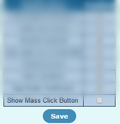
4) I can only see this being implemented as a tick setting.
(Maybe something like this)


16/100
 Don't have an account yet?
