") Don't have an account yet?
Don't have an account yet? 
Forum Thread
The Creative Corner (Art Club)! [Open!]
Forum-Index → Fan Clubs → The Creative Corner (Art Club)! [Open!]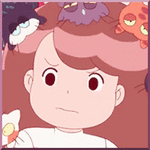

Posted: Sat, 28/10/2017 23:50 (7 Years ago)
I'll unblock u if u giev me 1000 million bazillion nuggie wugs : )))
Jk. Just gimme a sec.
Also I have some art I can edit in


Posted: Sun, 29/10/2017 03:21 (7 Years ago)
~Dcasom~ - oh dang, Kit, I really, really love the avatars you're comin up with lately ;; especially these halloween ones? d a n g
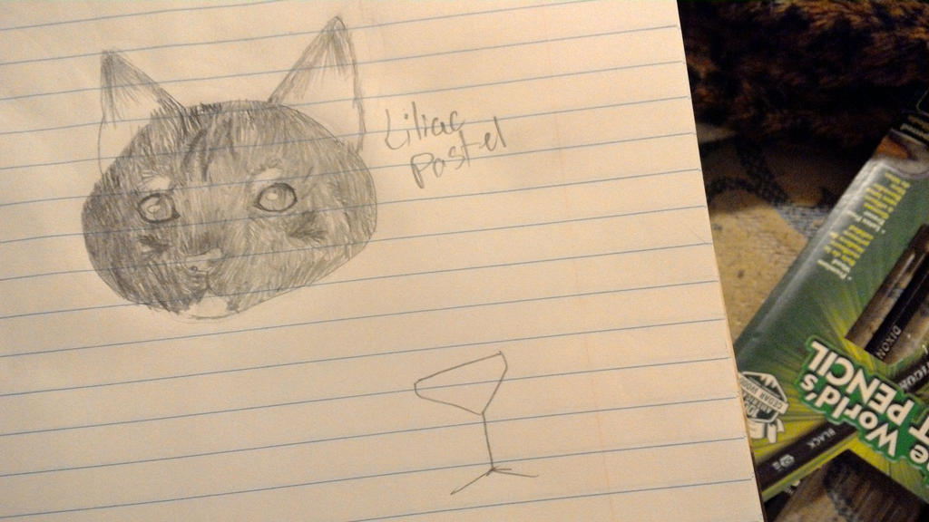
Liliac - I can't actually see the drawing you're talking about :v maybe try re-uploading through another site like imgur or something like that?
Heckcake - ahh, you have such a cute drawing style! ♥ both of your commissions to kit look great! and Aria is cute as heck aha
Argentis - wow u make these free avatars and u don't even make a pirate costume one???
but dang, your free avatars are looking great!
meme - I don't really know much about SU, but to me the outline is looking great so far! Aside from that, i'd be wrong of me to really say anything else as i've never actually watched anything related to the show before lol :c
Iiiiii have nothing to show since the laptop decided to die on me :v rip

Posted: Sun, 29/10/2017 03:26 (7 Years ago)

Posted: Sun, 29/10/2017 03:58 (7 Years ago)

commission for dcas, i'm seriously in love with this character !!!
--
@furret
aaa i love how you shade!!
@tcdl
woah! i love the hair! but he seems to have 5 normal fingers and no thumb--
@alexia
your art is super clean, especially for traditional :0
@liliac
yup, the image isn't there.
@argentis
the palette is really spooky ooo
@flam
i love the coloring, especially on the first 2,, they look so s o f t
@notkat
my child aaaa!!! thank you so much again!!!
@corvo
on the dragon, you should add a second wing behind the first, it only looks like there's one wing-- and on the last one, the feet and hands seem a liiiiittle big.

Posted: Sun, 29/10/2017 04:13 (7 Years ago)
that dragon is h e l l a
i love your new character in the yandere costume ;; their colours are nice to look at hh
@kot
your style brings justice to all the characters : okhand :
@flamey
i still yell at the two arts you did for me i really love them hhHHHHHH
your colouring style is A+++
@argentis
man i salute you because i can relate how hard it is to colour with limited palettes :"0
you did a great job on all the icons !!
@liliac
i cannot see neither of your art on both posts :"/
@meme
good luck !! it looks great so far ouo
@alexia99hunter
man that sharkapillar looks cool as heck :"D
you have a great sense of colour with the adopts ouo
@TCDL
holy hell this looks amazing !!! the details , the colouring, everything looks so good ;;;
i really like how you did their hair hhh and the veins on the eyeball and stalk is so hecking realistic ohman
@Furret
i will remove if you request so ouo
id like to say the body looks really off, mainly his underbelly,, its way too below his limbs which it shouldnt be. secondly, the underbelly should gradually curve in like this:
 Show
hidden content
Show
hidden content
notice the black fur aka underbelly
it pokes out (because ribcage) and then gradually curves in instead of remaining on the same "thickness"

wolf anatomy i found off google: (in reference to my reference hahaha)
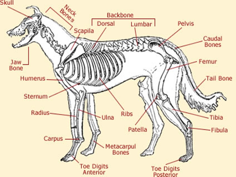
i hope this helps ;u;
other than that, the shading is hella pretty, the brush youre using is a perfect fit for shading fur! ouo
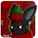
@toma
im going to cry
you already know my feelings towards this in the discord :")
Posted: Sun, 29/10/2017 04:16 (7 Years ago)
And really? It's a crayon brush :'D
Posted: Sun, 29/10/2017 06:51 (7 Years ago)
I'm artsy fartsy, let me join!
Username: Zuckerbeere
Thank you!

Posted: Sun, 29/10/2017 07:04 (7 Years ago)
Anyways, I did a thing and it's really late and I'm probably going to regret this later, but here it is.

There was going to be a background, but it's way too late for me to finish that now ^^'


^From Flight Rising^

Posted: Sun, 29/10/2017 23:20 (7 Years ago)
i am very proud of this right now owo
Posted: Sun, 29/10/2017 23:45 (7 Years ago)
Posted: Sun, 29/10/2017 23:57 (7 Years ago)


Posted: Mon, 30/10/2017 00:00 (7 Years ago)

Posted: Mon, 30/10/2017 00:43 (7 Years ago)
@Zucker
I agree with meme, I believe the reason it looking strange is because the other folded fingers are too small compared to the index finger. At that angle, you shouldn't be able to see the area of where the thumb connects(not attaches) to the index finger. Either that or that area is too large, but either way you shouldn't be able to see that.
Another thing is, there should be a little bit of a bump for knuckles on top of the fingers(folded ones).
The other hand is spot on though !
Posted: Mon, 30/10/2017 01:47 (7 Years ago)

im proud
Posted: Mon, 30/10/2017 02:18 (7 Years ago)
@Zucker - I have one critique - the mouth seems a bit off. Maybe try moving it over to the upper left a little bit. But I simply ADORE the hair and I think you have a good amount of human anatomy down pat.
@Liliac - Cute! But the eye is kind of squiggly and the ear looks off. The inner part of the ear should take up more space than that!
For Rhoosaurus:

Posted: Mon, 30/10/2017 02:46 (7 Years ago)
@alexia99hunter, quick question, for the "coloured" lines version of the Sewaddle/Sharpedo, are you using darker shades of the colours being outlined, or darker and less saturated? (Just a suggestion, if you can: perhaps you can put the black lineart on 50% opacity over the coloured lines, so it doesn't look as strong on the adopt.) Lopunny/Zangoose: I'm not sure if it's due to the angle at which your drew, but the fusion looks a bit off-balanced, like they're about to fall--could just be my failing eyes though. Otherwise your adopts look unique and have nice compatible colour palettes!
@The_Crazy_Dragon_Lady, I am very impressed with the glitch effect you have going on the Sceptic-eye head on the right. And I honestly wish it wasn't traditional, otherwise I would've said you should do more "glitch-bars" to sell the effect, it's a really wonderful piece!
@Furret, fabulous ghost-wolf, like whoa~
@toma, her center eye is wigging me out, and in a good way! Other than that, I'd recommend picking up some hand tutorials
@Myamoo547, that is one fierce looking roar by a draconic creature, props to you for expressing such a vivid emotion!
@Liliac, [1] that's looking rather nice, though I'm wondering if you've pressed harder with your pencil or used different lead pencils to shade that in? [2] As a critic, I will not hesitate to say that the digital version looks "less impressive" since you haven't gotten to shading it like the original traditional version had.
@Zuckerbeere, honestly the only thing I'd want to "critique" is the character's left hand: since you've "connected" the three fingers, the line you've used for the top of their hand sort of "separates" the index finger and thumb from the rest of the hand--and then there's that tricky illusion bit since the bottom of the hand is drawn near perfectly (IMHO)
@Furret,

"Bingpot."
Posted: Mon, 30/10/2017 02:57 (7 Years ago)
I'll come back to this post in the morning sometime to edit in critiques and stuff
 Just done it up for Doopliss ♥
trying to mess around with PTS brushes, i love "rustic" looks on pictures, so I'm just messing around with stuff like that now :') feelsgood to get the comp back up, thankfully still has PTS on it, only downside was losing all the custom brushes I have on the laptop .-.
Posted: Mon, 30/10/2017 03:34 (7 Years ago)
Thank you
yes i did press harder how ever the video i was watching got me confused so i pressed in and drew some how i think they erased and edited? i dont know but they made it confusing.
yes the second one i wasnt wanting to go into detail because i wouldve ruined it and got mad but still thanks!!!!
@furret
Thanks for telling me that!
all your critics are so great i am looking forward to improve
edit:
 quaaaaa

Posted: Tue, 31/10/2017 19:24 (7 Years ago)
So cute!
@Furret
Holy crap that is adorable!
@Kelp
That looks amazing
@Lilac
Cute!
~~~~~~~~~~~~~~~~~~~~~~~~~~~
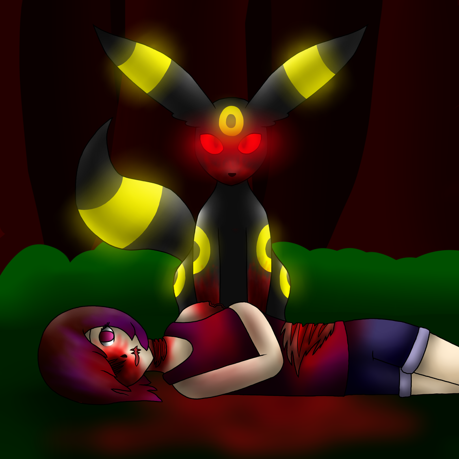
Here is the halloween thing that I had to remake before because my computer restarted on me.
Hope you all like it and any criticism will be appreciated!
With its black fur, it blends into the darkness. It bides its time, and when prey appears, this Pokémon goes for its throat, and then eats it.
Warning gore
Posted: Tue, 31/10/2017 22:41 (7 Years ago)
aw its so cute and great for today and the way the blood blends and isnt just red makes it look even better!
@all
i just got a driftloon from a creepy girl
anyone willing to draw it with a witch hat or something
i can pay or art trade