") Don't have an account yet?
Don't have an account yet? 
Forum Thread
The Everything Arts Club (Accepting!)
Forum-Index → Fan Clubs → Inactive Clubs → The Everything Arts Club (Accepting!)
Posted: Fri, 17/03/2017 23:59 (8 Years ago)

I just realized most of my characters have orange scarves
Also I don't know why I make the cats eyes like that
ALSO I don't know how to make headphones ;v;
(owo)
Posted: Sat, 18/03/2017 00:06 (8 Years ago)
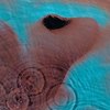
not enough pain & suffering 360/420
Also, I believe the problem might be how 'sharp' the noses are?? I'm not too sure myself honestly.
@Crystal
I love how the colours of the inner line art and then base colours really gives it a 'soft' look.
@Kitsu
A lot of people(including myself) have trouble with hands, so don't worry!
My only critique would be to move the flower crown a bit downwards, as of right now it looks as if the whole thing pulls the hair up forcefully(unless intended).
Either way, this one(and the DA floodings) honestly looks great, so keep up the good work!
@Lunala
Although I don't have a name for it, I really LOVE how the bones almost kind of show through it, like markings. Although I'm assuming you're keeping those there for reference, and aren't going to incorporate them as part of the design.
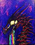
@Tech
I must say I love the contrast between the lights and the dark purples. It adds so much atmosphere to the piece!
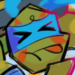
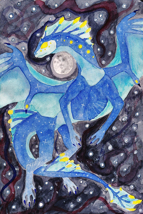
@Foxly
Those looks really good! Although I feel that the blue creature's faded dark blue circles really clash with the clean-ness of the lines and in my opinion would be better if they were dark blue circles over larger circles(of which has a colours between the base blue and the dark blue) to get that 'blended effect'. The soft faded blur really makes it seem a bit messy. Although that's just my opinion.
@Sky
Those are really impressive! Especially in my opinion Rep's one! Although for the first one I believe that the neck doesn't look quite right, but I'm not too sure if that was intended or not.
@Delcatty
I suggest adding some shading, so that the yellow of the bellsprout and the white of the emolga don't 'fade' into the background a bit.
Aside from that, it's quite cute and lovely!
@All
I'm a bit empty on what to draw, so I guess I'll be open for commissions?
Posted: Sat, 18/03/2017 00:10 (8 Years ago)
Honestly I'm fine with any price(as long as it's not too much), so I'll leave you with the decision. : )

Posted: Sat, 18/03/2017 00:45 (8 Years ago)
Thanks! ^^
And haha I think that's what his neck looked like? I drew him in a completely different pose than the reference so I very well may have gotten it off xD Oops
Also I may be interested in a commission if I have enough pd
@everyone
Edit: just finished this drawing of my new precious doggo


Posted: Sat, 18/03/2017 05:00 (8 Years ago)
So i did this v

rip this is ugly
Posted: Sat, 18/03/2017 15:06 (8 Years ago)
Posted: Sat, 18/03/2017 15:43 (8 Years ago)

Did this for a smol thread of mine~
Posted: Sat, 18/03/2017 16:31 (8 Years ago)
Ohhhhh I need to go ask something (goes to thread after posting this)
@All
Kitsu and I did a collab, she did the lineart and I colored <3


Posted: Sat, 18/03/2017 17:33 (8 Years ago)
Posted: Sat, 18/03/2017 18:26 (8 Years ago)
meh :0
mmm.. amongus macaroni... hey guys? what's that? uh. guys? guys? you're gonna wanna see this....... [i proceed to get blown up]
avatar by tocartss @ twitter
Posted: Sat, 18/03/2017 18:33 (8 Years ago)
peeps don't seem to know that i sculpt as well
[i'm a broad hobbyist, not good but broad]

omg, this picture was taken with my old camera
rip old camera
Posted: Sat, 18/03/2017 20:24 (8 Years ago)
woa H
thats like
a lot of detail jfc
---

i drew my new chusona!!
Posted: Sat, 18/03/2017 20:28 (8 Years ago)
hahaha, thank you
the wings ate top-heavy though
hence the wood there to support the backlegs
oops
and that chu looks soooo nice
i just can never draw a chu nice n cute
i just can't TTwTT
aaah, it looks so good
Posted: Sat, 18/03/2017 20:29 (8 Years ago)
i lov
- - - -


chu customs /o/
Posted: Sat, 18/03/2017 20:30 (8 Years ago)
i hope that when you move the wood it doesn't collapse cuz that would really suck lmao-
and thank you ;w; i haven't pixeled in a while so i had no idea how to shade it lol
@lizzu
A E S T H E T I C af omg
Posted: Sat, 18/03/2017 20:53 (8 Years ago)
I really like the glitter effect used there!
And I mean- there isn't any price limitations, can be as long as you'd like haha
Unless you were going for that effect, the collab looks a bit 'blurry' with how some colours go out of the area :0
@Kitsu
Wow, it looks great and I really don't have any critique on it!
@CrazyDragonSculptures
I agree with the wings part, but besides that, that sculpture is really nicely done!
I also agree that there's seriously a lot of detail!
@hootyy
o boi it floats!
That looks great! I especially like what you've done for the sort of cheek furs!
Although the right legs looks a bit too wide because of how you've used the same tone of shading for the edge of the legs and the base of the tail.
@Liz
Gosh those are amazing!
I love those two toned eyes on the first one!
as well as the light shading!
Posted: Sat, 18/03/2017 21:26 (8 Years ago)

those hands took way too long uvu
Posted: Sat, 18/03/2017 22:17 (8 Years ago)
That's quite a cool fusion!
I love the expression the teeth and eyes give omg
it looks so mad
@-nebby-
I love the colour choice for the background so far!
I can really see the effort put in the hands tbh
@all
WIP for Kitsu

I'll probably fix the wings so that they'll have the same amount of 'gassy-ness' the clouds have, instead of being so solid.