") Don't have an account yet?
Don't have an account yet? 
Forum Thread
The Creative Corner (Art Club)! [Open!]
Forum-Index → Fan Clubs → The Creative Corner (Art Club)! [Open!]
Posted: Sat, 23/12/2017 02:53 (6 Years ago)
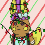
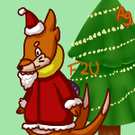
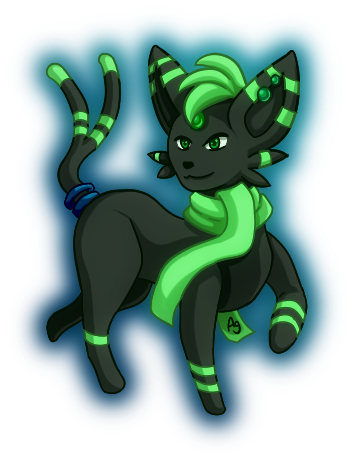
anyways i did a lil drawing of frost byte for the christimas season
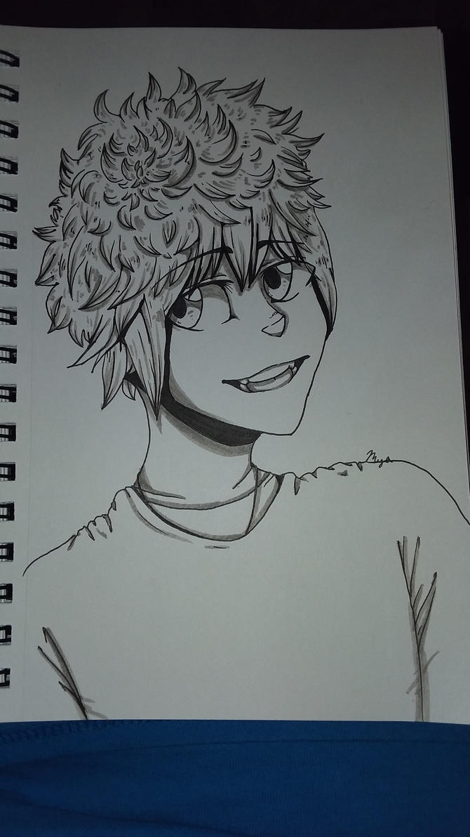
i gotta get better at drawing rotoms


Posted: Sat, 23/12/2017 04:49 (6 Years ago)
 Show
hidden content
Show
hidden content
im auctioning this out!! ending in like,, 2 hours idk
i also have an adopt auction feed if you wanna check that out!!
crituques!!
Show
hidden content
HOLY HECKIN @AKIRURU
AHGLKSBHGKSBADKLGHSALKGHKLASHGKLAGD;S THAT IS AMAZING WTF
@arti
ooooo style change hm >:^
also yeah i forgot about that WOOPS
@meme
i like the character :0 but i do suggest adding some color! otherwise everything is fine!!
@liliac
awww cute doggo
i like your coloring but it looks weird to me ack
it looks like the doggo is squished? and is crossed eye :'u and that the ears are really high up
@woopers
OOF that is nice
also i like the pose of the character in the spoiler :00
@meme 2
i like the color choices!! but i think its a bit bright ackk
@sis
uuuuuUUUUU amazing bean :'(
@meme 3
i like the rotom!! and i like the bg :00 although i suggest fixing the hat a bit? the middle part of it is wider than the base and santa hats are triangular :0
Posted: Sat, 23/12/2017 17:24 (6 Years ago)

@ThtGayGuy: Where's the nose? Also, the feet look a bit uneven.
Art Shop
Avatar made by me!
Posted: Tue, 26/12/2017 01:57 (6 Years ago)
I LOV although id suggest adding shading <:3c
@meme
hey thats super great :3 but id suggest not using shape tools or copy/pasting parts (like the arms and eyes) and adding shading!!
@Akiruru
CRIES// why is your art so GREAT ;;
@meme (again)
same as first critique ^^
@Liliac
the fur looks kinda spiky
id also suggest placing hairs by shading and not by random
andd time for my (recent) art
Show
hidden content
 (click to enlarge)
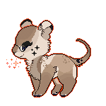
 (click to enlarge) (i did this as test
in paint tool sai,,i'd really like critique on them)
(click to enlarge) (i did this as test
in paint tool sai,,i'd really like critique on them)
Posted: Mon, 01/01/2018 05:25 (6 Years ago)

Posted: Mon, 01/01/2018 05:50 (6 Years ago)
Title: hello !

Posted: Mon, 01/01/2018 05:53 (6 Years ago)

Posted: Mon, 01/01/2018 06:00 (6 Years ago)
---
@aki
AaaaAaA thats so beautiful i lov
@gaysisn
The anatomy and all is in point but i dont find the colors v eye-catching :"u
@littlegamer
Awww it's so cute ♡
@zorua
Your art style is ♢ g o a l s ♢
---
@all
Woof art dump with some re draws for new year aswell
Posted: Mon, 01/01/2018 13:22 (6 Years ago)
The character is so cute but i must agree with Crys about the colors :0
Aki
Omg that's amazing !!
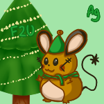
Littlegamer34
That ferret is so cute,overall you could try working more in the legs/feet
Crystalcat
He c c ur art is cute!! and the improvement is visible ( o v o)b
I am finally finished with this hell of a drawing of my character Raphael
Time for me to die


Posted: Tue, 02/01/2018 05:25 (6 Years ago)
Show
hidden content
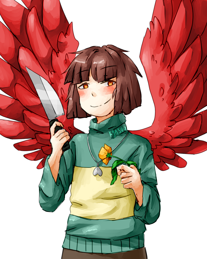
@ThtGayGuy, [1] I feel like you could
probably make the knife lines--those that are surrounded/touching
the red-pixels, a darker red. Just a thought. [2] That explosion of
colour really works and I can't pin down exactly why it does, but I
like it!
@woopers, [1] I really like how you did the folds in her clothes! [2] Nice colour on the charataker
@arti, [1] Your new daughter looks adorable, especially with the bear-face on her dress 'frowning' aha [2] Interesting expression there tho.
@Liliac, [1] I'd suggest slowing down the frame-speed for the pixel-avatars (if you still have the files, I mean). Your snouts look rather good! [2] The snout looks a tad long, though it might just be that it looks that way since the head isn't connected to a neck... But what do I know about drawing canines and snouts, aha
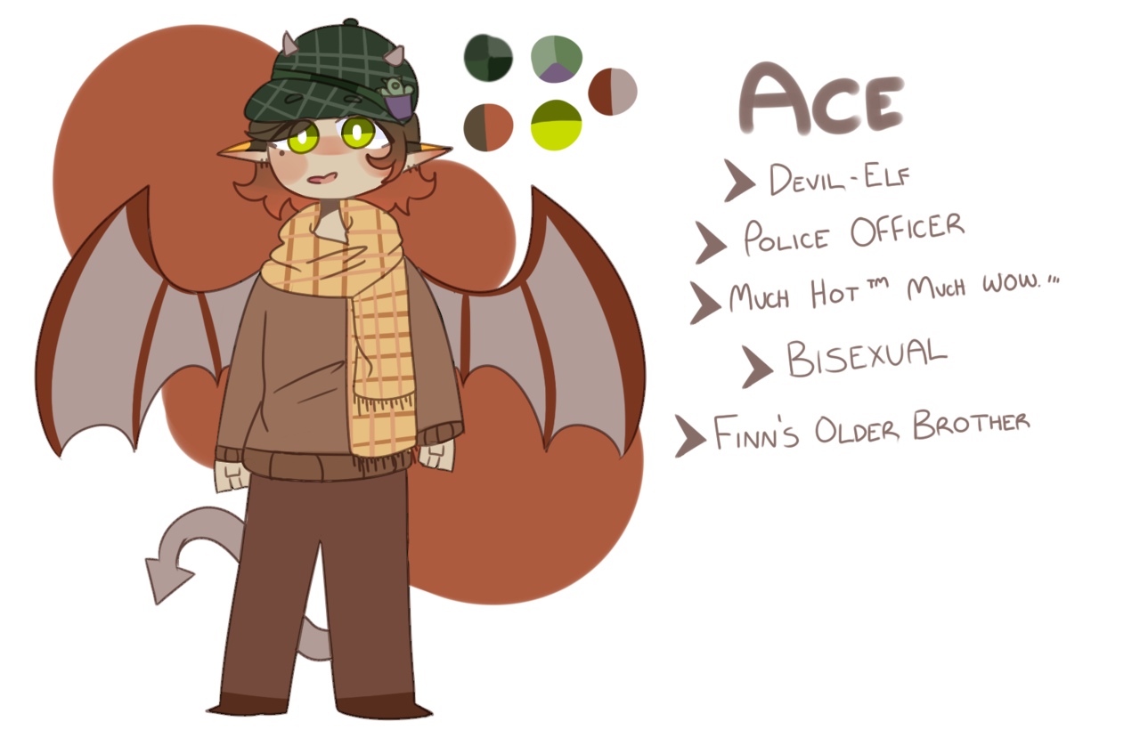
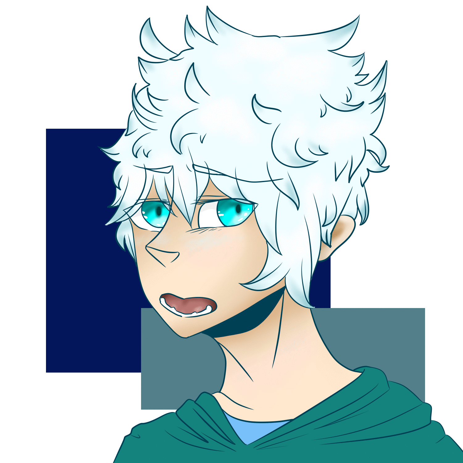
@meme, [1] Is this your first time drawing a pony-head? I think the mane looks a bit low and should be higher-up, like on the top of the pony's head. [2] Your 'sona is a Rotom with a bowtie? [3] Did the bowtie gain red or no on the Blacephalon? [4] I'd say you've got a good handle on drawing Rotom
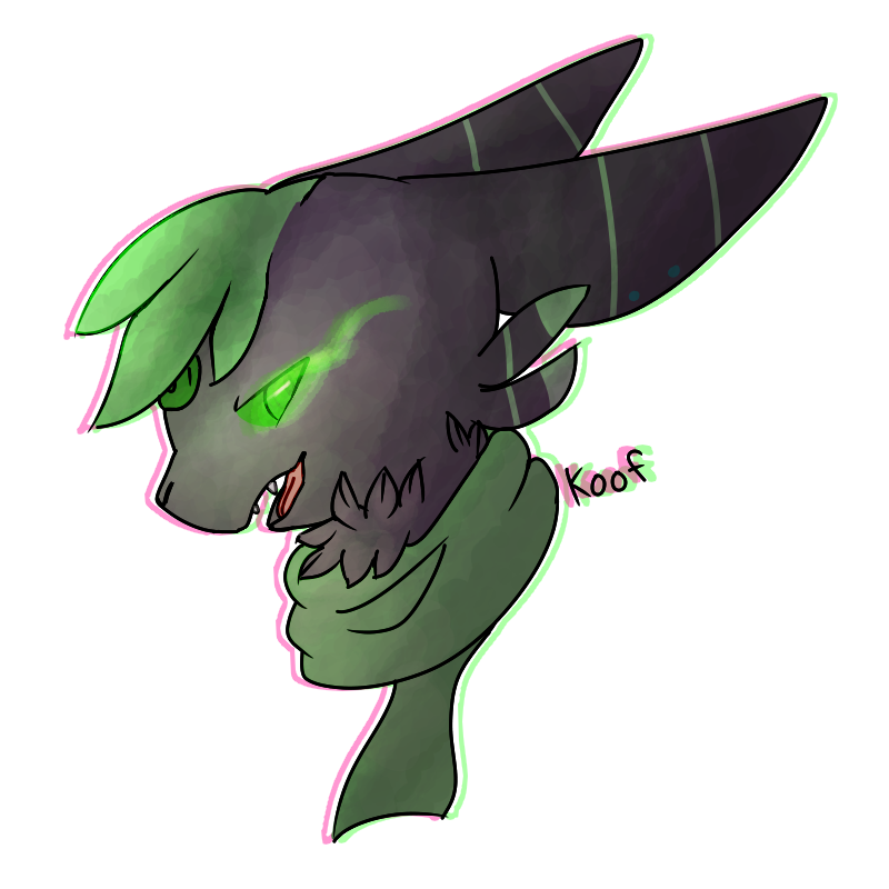
@Keef, lovely art, I'm not sure where to critique about it ah...maybe shading on the markings for the tail? Or more shading, rather. They kind of look inked-on and don't really "flow" with the tail's suggested movements.
@kitkat, I really like the effect you put for the Pikachu-looking character (the one with the anchor on its tail). Mind if I ask you how you did it??
@Crystalcat, [1] I like the crayon-sketch effect you have on some of that art! [2] It's always great to see improvement in one's art
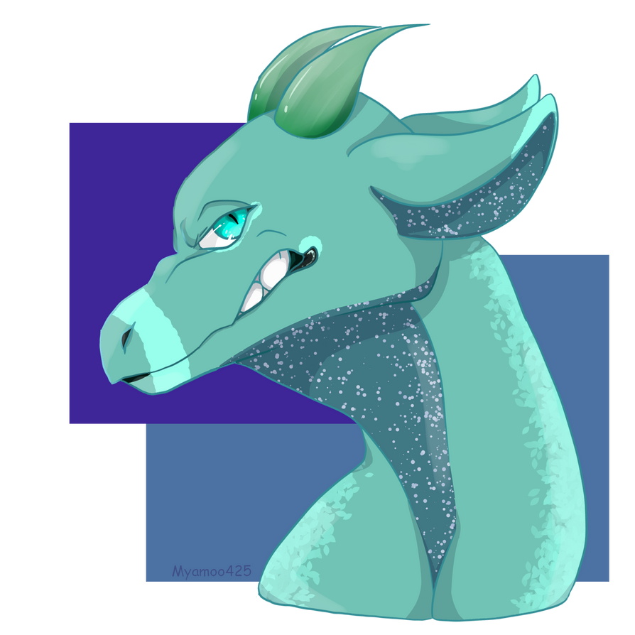
@Akiruru, That's a magnificent creature, whatever it is you drew, it is just magnificent!
@Littlegamer34, I feel like the acorn that your ferret is holding should be bigger, as a "relative-size" indicator thing
@Zorua, I am envious of your ability to draw snouts nicely
@BanetteXD, that light-butterfly is gorgeous, but just a really tiny note: on the angel's left shoulder-ish, there's a prismatic back-lighting thing going and I don't know why I noticed it but since I did, I'm kind of going "is there supposed to be the same rainbow-y light on the right wing too??" aha
@woopers, [1] I really like how you did the folds in her clothes! [2] Nice colour on the charataker
@arti, [1] Your new daughter looks adorable, especially with the bear-face on her dress 'frowning' aha [2] Interesting expression there tho.
@Liliac, [1] I'd suggest slowing down the frame-speed for the pixel-avatars (if you still have the files, I mean). Your snouts look rather good! [2] The snout looks a tad long, though it might just be that it looks that way since the head isn't connected to a neck... But what do I know about drawing canines and snouts, aha
@meme, [1] Is this your first time drawing a pony-head? I think the mane looks a bit low and should be higher-up, like on the top of the pony's head. [2] Your 'sona is a Rotom with a bowtie? [3] Did the bowtie gain red or no on the Blacephalon? [4] I'd say you've got a good handle on drawing Rotom
@Keef, lovely art, I'm not sure where to critique about it ah...maybe shading on the markings for the tail? Or more shading, rather. They kind of look inked-on and don't really "flow" with the tail's suggested movements.
@kitkat, I really like the effect you put for the Pikachu-looking character (the one with the anchor on its tail). Mind if I ask you how you did it??
@Crystalcat, [1] I like the crayon-sketch effect you have on some of that art! [2] It's always great to see improvement in one's art
@Akiruru, That's a magnificent creature, whatever it is you drew, it is just magnificent!
@Littlegamer34, I feel like the acorn that your ferret is holding should be bigger, as a "relative-size" indicator thing
@Zorua, I am envious of your ability to draw snouts nicely
@BanetteXD, that light-butterfly is gorgeous, but just a really tiny note: on the angel's left shoulder-ish, there's a prismatic back-lighting thing going and I don't know why I noticed it but since I did, I'm kind of going "is there supposed to be the same rainbow-y light on the right wing too??" aha
Show
hidden content
Snowman
 |
|  |
| 
ONIKITSUNE | Bloop | KingDecidueye
 |
|  |
| 
CatLady | Kubes | Skypanda
Gingerbread
RandomAppleSoda04
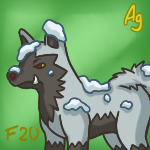
Snow-covered
 |
|  |
| 
Meatball | Snickers | ThatGuy
 |
|  |
| 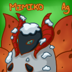
NauticalStag | carterd888 | Mimiko
 |
| 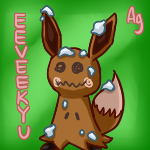
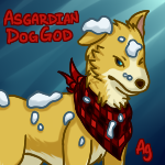
AsgardianDogGod | EEVEEKYU
Elf
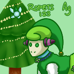
Ropets123
Candycane
Pitohui
Customs
 |
| 
Filip666 | Sammyboy
 |
| 
Kigome27 | StarChild
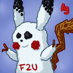
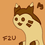
Free 2 Use
| | ONIKITSUNE | Bloop | KingDecidueye
| | CatLady | Kubes | Skypanda
Gingerbread
RandomAppleSoda04
Snow-covered
| | Meatball | Snickers | ThatGuy
| | NauticalStag | carterd888 | Mimiko
| AsgardianDogGod | EEVEEKYU
Elf
Ropets123
Candycane
Pitohui
Customs
| Filip666 | Sammyboy
| Kigome27 | StarChild
Free 2 Use
New Years Fireworks
Show
hidden content
 |
|  |
| 
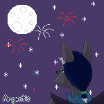
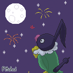
Argentis | Pitohui | -Naoto-
 |
|  |
| 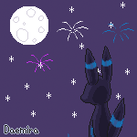
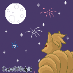
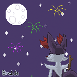
CassOfDelphi | Braixie | Daemira
 |
|  |
| 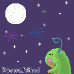
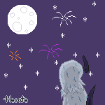
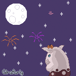
-Hecate | Girafarig | Princess_Politoad
 |
|  |
| 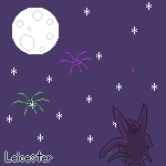
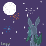
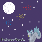
Leapy | Professor*Acacia | Leicester

"Bingpot."
Posted: Fri, 05/01/2018 06:27 (6 Years ago)
wow there wasn't a lot of posts eh,,,
lemme revive this real quick
critiques vv
Show
hidden content
@meme
waowao yep uve improved on drawing some rotoms~ again, try to use different and usually smaller brush sizes so that it doesnt look so bold :0! also not using the square/rectangle/circle tool as much :>
@tgg
sobs such nice pixels!! the anatomy is well done and for some reason for me, the colours seem to mix really well?? idk whats with my eyes but they look nice to me :>
@littlegamer
aaaaa ferrets~ i havent seen much people draw em- i suggest added some fur spots and not just making a smooth line, so that it looks more fluffy and more dimensional if that makes sense- also adding some shading would help~
@zorua
they seem really good! that brush u use added with the fringe is just mmmm good stuff mate-
i suggest tho when you're extending the picture to make the little border around the character to try to refine the sharp edges, to make it look natural since some of the borders are kinda disappearing into the pic uvu)
@crystl
ohMYGOD THAT IMPROVEMENT DAMN- the first pic with the improved version was more smoother and was v aesthetic!! god ur style is so cute,,, ur pokemon anatomy, human anatomy and animal anatomy are really improving! keep up the hard work ovo)b
@banette
sobs,, that colour palette is so nice my god- the yellow makes this atmosphere i cant describe and it makes me emotional man,, the anatomy is spot on and the highlights are just MMMMM- :ok_hand_sign: i can really feel the emotion in this piece ;v;
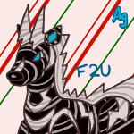
@argentis
aaaaaaaaahowareyousomotivatedtodoallofthesewithoutgivingupwhattheheck
i love how you can still get the feeling of it being a snowman, but the details are so good so that they look more like the persons character ;v; ) theyre really lovely man!!
now for some art i made :>~
new charas;

and some art (mostly traditional, which u can see on my instagram if youre interested!)


Posted: Sat, 06/01/2018 00:08 (6 Years ago)
hhh your human designs are always so cute !!
——
ive been dead
because I spent most of my time on this thing ewe
—-
+ a random thing for keef
Posted: Sat, 06/01/2018 06:34 (6 Years ago)
@kitkat, Monet's looking pretty spooky whoa
Forgot where I put this, but I had Keef as my Secret Santa Art Exchange Giftee!
"Bingpot."
Posted: Thu, 18/01/2018 23:26 (6 Years ago)
@kit i like the shading ooh
@argentis the blurry outline looks cool and fairly easy to do, mind if i try experimenting with it or something?
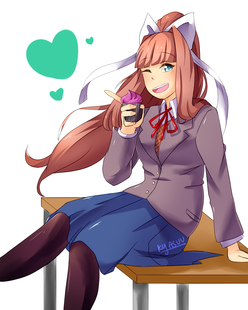
Tried to draw a DDLC sticker version of him
he also needs a new name

Posted: Fri, 19/01/2018 04:31 (6 Years ago)
highlights:
monika
a redraw
chara
Critiques and comments!
@meme:
the lines are super clean!
@argentis:
i rly like the drawing! the shading is done super well!! but i think the eyes are a bit too close together? thats it i think
@kit:
AYYYY RAWR
looks good~
@arti:
YOUR HUMANS ARE SUPER ADORABLE AND I LOVE UR ART STYLE THANKS
@banetteXD:
woah!! i love the painting effects i am j ea l ous????? ur hands are so good too wtf
Posted: Fri, 19/01/2018 04:35 (6 Years ago)
I felt like my main fursona, Jupiter, the purple doggo was kinda plain, so, i'm working on revamping her!

I was experimenting with some things, so I know it isn't great,, but i'm really proud of it. I added a lil curl of hair, freckles, and a new necklace! that's only the top part, though!
Posted: Tue, 23/01/2018 15:30 (6 Years ago)
Posted: Fri, 26/01/2018 01:06 (6 Years ago)
@light cute!! I like the colors
little thing I did of byte's text form


Posted: Fri, 26/01/2018 05:56 (6 Years ago)


^From Flight Rising^
Posted: Fri, 26/01/2018 22:40 (6 Years ago)
Username: WhisperingThief
Thank you!
